Reflect the real standard of the service
The previous site felt dated and did not match the care, quality, or premium residential experience Seamus and his team deliver
Client website · Case study
The website translates a life-changing residential retreat into a clearer online experience: what the stay feels like, who it is for, how it works, and why the support goes beyond weight loss
Website pages
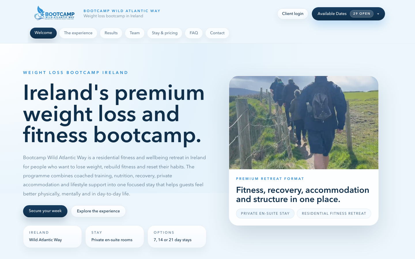 Bootcamp Wild Atlantic Way welcome page
About the business
Bootcamp Wild Atlantic Way is a residential fitness and wellbeing retreat in Ireland. Guests may arrive to lose weight or rebuild fitness, but the service is designed around something more lasting: practical habits, confidence, structure, recovery, and a healthier relationship with everyday life
What needed to change
The previous website felt dated and did not reflect the premium, human service Seamus and the team provide. It lacked its own search foundations, and even Google results surfaced WordPress branding rather than the Bootcamp identity. Prospective guests could not easily understand the depth of the experience or why it is different from a generic weight-loss programme
The previous site felt dated and did not match the care, quality, or premium residential experience Seamus and his team deliver
Visitors needed to understand that the experience is not a generic weight-loss promise, but a supportive route into physical and mental wellbeing
The details around the stay format, accommodation, availability, and next steps needed to be easy to find before someone made contact
The RivCor response
We immersed ourselves in the Bootcamp experience to understand the people it serves, the daily structure, and the care behind it. The new website centres Seamus's human approach: guests come to lose weight or rebuild fitness, but also to learn sustainable habits, feel supported, and care for themselves physically and mentally
We created a premium, experience-led website that turns the stay into a coherent story. It gives prospective guests a clear sense of the environment, the support around them, the formats available, and the next step without losing the warmth that makes the Bootcamp personal
Designed around people
For someone considering a reset
A clear introduction to who the retreat is for, including beginners and people returning to fitness after a difficult period
For a prospective guest
Training, nutrition, recovery, private accommodation, and aftercare are explained as parts of one supported residential experience
For booking
Visitors can compare 7, 14, and 21-day formats, secure their place, and understand how date selection and guest details work
Key capabilities
The details are shaped around the people, context, and business need behind the work, not added simply because they are available
A clearer journey
Discover the retreat
Understand the approach
Explore the stay
Choose a format
Secure a week
What the work is designed to improve
Client review
“The new website feels much more like the experience we offer. It presents the Bootcamp in a more premium, human, and professional way, while making it easier for people to understand what a stay involves, who it suits, and what support they can expect. The information about the training, accommodation, stay options, and next steps is much clearer, so prospective guests can explore the details before getting in touch. Since we improved the website's SEO, I've started receiving a lot more enquiries by email. It feels like the website now represents the care and quality of the Bootcamp much more accurately”
Seamus, Owner of Bootcamp Wild Atlantic Way
Your project